Course 3 Final Project

Final Project – Tech Tools for Collaboration

Why Collaboration?

For my final project for course 3, I chose the professional learning option, as I wanted the opportunity to work collaboratively on a learning experience for staff. I formed a working group with Alex, Saadia and Matt. We decided to focus our efforts on collaboration and specifically focussed on the ISTE standards 4a-Dedicates planning time to collaborate with colleagues to create authentic learning experiences that leverage technology, and 4b-Collaborates and co-learns with students to discover and use new digital resources and diagnose and troubleshoot technology issues. This project would also provide me with a useful presentation that I could utilize in the near future at my school. The topic of collaboration is one that fascinates me. We all collaborate, a great deal of the time, but what makes for effective collaboration where the product we create is actually better than what we could have produced individually? How do we collaborate effectively in order to produce quality and creative work? What tech tools help us to enhance our collaboration? These were some of the questions that I wanted to provide answers for.

How Did I Grow?

During course 3 I definitely grew as a facilitator and a collaborator. For two of my blog posts I had the opportunity to seek feedback from students, who can be the most honest, and harshest of critics. My blog post A Collaborative Discussion provided me with the environment to discuss with students their social media habits, and Curb Appeal, allowed me to seek feedback from students regarding a previous learning experience I had provided for them. Facilitating these discussions allowed me to work on and improve on my ability to listen in an authentic manner. Facilitating discussions with these students also made me work on my questioning skills. As a collaborator, like the last course, the challenge was working with group members from around the world (USA, Japan, South Korea). While a great opportunity, this also presents the challenge of being very timely with deadlines in order to allow group members to move their work forward.

Photo by Sharon McCutcheon on Unsplash

Am I Creative?

This course definitely allowed me to unleash my creativity. I would not typically label myself as someone that is creative, but I would definitely label my work this course as creative. From the opportunity to build an infographic, to reworking a previous learning experience for students, to building a new learning experience for educators, I am definitely proud of this work, and I think all of it, besides having solid content, is highly visually appealing too!

Photo by Briana Tozour on Unsplash

What Do We Want Others to Learn?

With this learning experience our hope is that educators walk away with three things. The first is to reinforce why they collaborate. I think most educators know why they do it, but it is always good to dig into research about any topic and to reinforce “The Why”. Additionally, having conversations around this can help to eliminate any doubt about the benefits of collaboration amongst students and amongst teachers. Also, providing participants with new options for how to collaborate.  Lastly, giving educators some options when it comes to tech tools and collaboration. We carefully selected 6 tech tools that can drastically enhance collaboration, and I think there is something new for every participant.

Photo by Kimberly Farmer on Unsplash

How Do We Know They Have Learned?

Although we did not facilitate this experience, I plan to at some further point in time. There are a few ways to understand the depth of learning that has taken place. The first would be to use the data collected from the Google Form and determine what the key takeaways from the session were for participants. Secondly, I would follow up with participants to dive into the tech tools and determine how we could incorporate them into their own professional learning communities, or their classrooms, for them to use with students. Another option would be to have superstars (those that are effectively using the tools) highlight how they are using them at a staff meeting. I find it always more powerful when teachers can teach teachers, the learning is much more authentic that way. Overall, I think that this learning experience will be highly beneficial for any educator, whether an experienced or novice collaborator.

Hearing All Voices

Photo by Nathan Dumlao on Unsplash

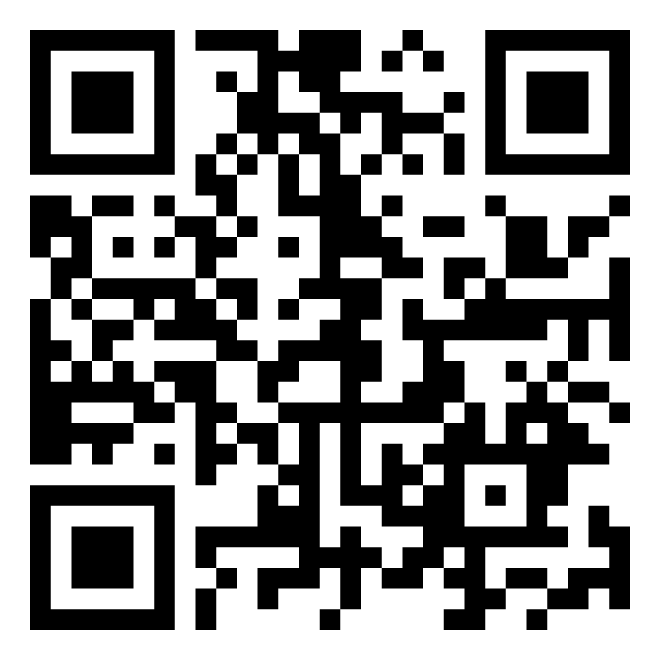
For those readers who are not in the COETAIL course, I invite you to get involved with our reading this week! Here is the QR code and link to our community Flipgrid. Our reading this week is around the Harro’s Cycle of Socialization. We ask that you read the chapter, and share with us one word, one phrase, and one sentence that impact you, or that you found significant. Please add yours and feel free to listen to others!

QR Code to Flipgrid and This Weeks Reading!

I have found Flipgrid to be quite a useful tool that I pass on to others at any opportunity. It is such a versatile option that can be used with students or fellow educators. The activity that we engaged in this week was new for me, but I really liked the way it allowed us to consolidate what we read and convey that through a video response. But, what I enjoyed even more was the opportunity to hear how others interpreted the reading and consolidated their learning.  All of us interpreted the reading in such similar, yet different ways. This is the beauty of a video tool like Flipgrid, as it allows us to quickly hear so many different voices, and respond to them. Beyond the walls of our classrooms and schools, Flipgrid can be a great tool for connecting with other classrooms and colleagues around the world. This can greatly enhance the real world application of Flipgrid. There are two resources that I wish to share. The first comes from Sean Fahey, Karly Moura & Jennifer Saarinen, called The Educators Guide to Flipgrid. This is the latest edition and a great resource for getting started. And this great resource from Ditch that Textbook on 15 ways to use Flipgrid in your class. It has some solid suggestions you might not have considered for using this tool.

Photo by Jordan McDonald on Unsplash

I now want to switch gears from Flipgrid to our reading this week. As I mentioned briefly in my Flipgrid video, my practice has always been impacted by thinking of those who are oppressed. I had my first racist experience when I was in grade 3 and since that time I have always been aware of my differences. Through every oppressive experience that I have had, it has strengthened my resolve to make the world a better place. As I started in education, these experiences helped to shape how I looked at my students, curriculum, access to resources, the teaching and administrative body of the school, or school board, and how the community impacts all of this and vice versa. In my first teaching role, I worked with at risk students, and I quickly drew connections with the socio-economic situation of my students and their placement in my program. For me it was an awakening regarding their access to resources due to no fault of their own. This consciousness has always been a part of my approach. 

Photo by Shane Rounce on Unsplash

I have been so blessed in my career with opportunity.  With every opportunity that I have had, I always take an equity approach. How are we working with marginalized groups, whether it be by class, race, gender, sexual orientation, socio-economic status, or some other form of oppression. Where are the opportunities to inform and teach our students that inequities exist, and where are the opportunities to teach them how to use their privilege to help level the playing field. As educators we are in such a special situation to not only teach curriculum, but teach what makes character, and to me, this is just as important, if not more important than the curriculum, because we need more kind and caring people in the world.

Curb Appeal

Photo by RhondaK Native Florida Folk Artist on Unsplash

In the first blog post for Course 3 I briefly spoke about working with middle school students who were creating TedTalks and the opportunity I had to teach them about the CARP acronym. For this week’s task, I decided to take that presentation and utilize the resources provided to create version 2.0. But before I dug into the reading, I decided to ask some middle schoolers from last year who had been through my session what they thought of the presentation, or any improvements that should be made.  The most frequent things that I heard, in terms of constructive feedback, were to include more visuals and fewer words. Remember, these were students who had now built their own TedTalks, watched a number of them, presented to parents, and watched their peers present to parents. So needless to say, I was taking their advice to heart!

Photo by Jason Rosewell on Unsplash

Both blog posts from Presentation Zen also impacted my thinking. The first article, 10 Tips for Improving Presentations, really got me thinking about good storytelling when making a presentation. The suggestions to demonstrate some type of conflict in your story and to make your audience feel are important factors. As I thought about teaching students to create powerful TedTalks, these are elements that can make a big difference as they try to pull in their audience. The second resource, What is Good Presentation Design, also provided me with a new perspective. The section on visual makeovers and the before and after pictures, gave me some great ideas for my own presentation to the students. 

Photo by Teemu Paananen on Unsplash

From attending past conferences, especially Learning 2, conferences, I had some ideas as to better my presentation.  At Learning 2 there is a structure where each day starts off with Mini TedTalks. The presenters have 5 minutes to share a message and the visuals that accompany these talks are powerful and poignant. I highly recommend watching some of them here, and paying attention to their visuals while listening to great storytellers.

You can see some of the before and after shots here:

Before
After
Before
After
Before
After

Here are the full links to my presentations:

How to give a TedTalk Version 1.0

How to give a TedTalk Version 2.0

My biggest takeaway from this presentation is that visuals have a big impact. I have always made a point to have eye catching visuals that relate to the message or theme of the presentation, but I would just throw them on a slide, without really thinking through the impact I was hoping to achieve.  This week’s learning has really caused me to think about the size of the image, the placement, the color, and the adjustments that I make to that image (transparency, shadow, etc). These design elements can have a huge impact on what you are saying, and how that information is taken in by the audience, and what they remember once they leave your presentation. This week has been a huge area of growth for me, and I am excited to see what changes others made.

Making Pretty Data

Photo by Luke Chesser on Unsplash

I am a really big fan of infographics. I think most of us are. The visual appeal, the numbers, the quick read, it has many elements to make them attractive in our world of readers with a short attention span. I also really find them useful, because they can deliver a lot of information in such a short visual or read. This can be great when our readers don’t have a lot of time, or we are looking to grab the audience’s attention really quickly. This week there were some solid resources, but the one I really want to highlight is the TedTalk by David McCandless, entitled The Beauty of Data Visualization. I found this talk fascinating, and full of some really salient points. I enjoyed his point about data literally pouring into our eyes on a constant basis, and the joy that we feel when we come across a beautiful graphic or a beautiful data visualization. Additionally, his point around layering data sets was spot on. When we can do this, then we make true sense of the numbers. I don’t want to ruin it for you, but his examples are excellent, and I highly recommend this video!

Photo by Stephen Dawson on Unsplash

The purpose of my infographic is to inform our employees about our tech ticketing system.  I started at the International School of Curitiba in August 2018 and prior to this, there was no formal way to lodge a tech help request.  Sometimes emails would be sent, or a phone call made, or in some instances, someone would come to the IT Office to ask for help. There was no formal way to track data. Once I arrived, we implemented this system so that we had a formal way to lodge requests.  Additionally, this would allow us to collect data on what the actual requests were, our response times, and how long the requests took to actually service.

Produced with Canva.com

My process in creating this infographic was similar to creating a lesson or unit. I began with the end in mind.  I thought about who the audience is, and what I am trying to demonstrate. Once I had those ideas mapped out, I needed to pull the data from our ticketing system.  We currently use Spiceworks as our application of choice for our ticketing system and we drive the application through our school intranet. You can see a picture below of the user interface for the teachers that they use on our intranet.

ISC Intranet

Spiceworks does track some data within the platform. You can see those pictures below. However, the data is only tracked for a day, seven days, or thirty days. So to obtain the data for the infographic, I pulled everything since we started using the platform into a spreadsheet and cleaned that data from Google Sheets to produce my pie charts that are in the infographic.

Example of Data from Spiceworks

I posted the first version to Twitter to gain feedback, and was given several suggestions, which I incorporated into version 2.0 (the one that is posted above). Additionally, I shared it with the School Wide Leadership Team at our school so that they could see the work that was being done by the IT and Innovation team. They were surprised by the number of tickets that the department handled, and that the response time was within a day. We also have a weekly newsletter for our divisions; ECC, ES, and MS/HS, and I placed the graphic in those so that teachers could see how we were performing and responding to their needs. This has also served for some great conversations within our department. We purchased new printing software in August 2019 and this helped reduce the printing errors, and thus the number of tickets. We purchased a new WiFi system in August 2019, and this heavily increased tickets to support this new system in August and September. Additionally, we took on PowerSchool in August 2019 as our new Student Information System, and this was added as a support option for this school year. I am interested so see the data visualizations that others produce and their thinking behind them.


A Collaborative Discussion

Photo by Zainul Yasni on Unsplash

This past week I had the opportunity to sit down with some middle school students to talk about their online behavior and social media. I was curious to get some honest feedback around their online habits, how much time they spend on social media, and their own thoughts and experiences with being online.   Prior to this conversation with the small group, I surveyed our middle school population on their social media use and screen time. The results of this survey can be seen below.

ISC Middle School Students Social Media Use
What Social Media do you use?

  • WhatsApp(91%)
  • YouTube(86%)
  • Instagram(71%)
  • Snapchat(32%)
  • Twitter(20%)
  • Facebook(6%)
  • Others – Reddit, TikTok, Pinterest

These survey results were also shown to parents at a recent presentation to middle school parents regarding online safety, social media, and screen time. Here is a copy of the presentation made to parents

MS Online Safety

After this initial survey and presentation with parents, I was able to sit down with a group of ten middle school students to dig into their experiences further.  Before I sat down with the students, I made sure to give them the questions ahead of time, and to set the rules for our discussion. At our school, we have recently adopted norms of collaboration, which were heavily influenced by the Thinking Collaborative. You can find our version here:

Norms of Collaboration

These were used to guide the discussion.  Additionally, the ISTE standards that I chose to frame the discussion are found here:

ISTE Standards for Students:

2a

Students cultivate and manage their digital identity and reputation and are aware of the permanence of their actions in the digital world.

2b 

Students engage in positive, safe, legal and ethical behavior when using technology, including social interactions online or when using networked devices.

Here were the discussion questions that I used:

  1. Where do you use your devices at home?
  2. What does it mean to balance technology in your life?
  3. Do you communicate about your devices with your family on a regular basis?
  4. What is the difference between using devices at school and at home?
  5. What does staying safe online mean to you?
  6. How do you stay safe with social media?
  7. Where do you charge your devices at night?

Due to confidentiality, I will not share the answers here, but what I can say, is that the discussion was extremely rich, and that one period was clearly not enough time, as the discussion could have gone on for hours. The second part of our discussion was a very quick design challenge in which I asked them to pair up and design a set of guidelines that they would use in their home around tech use and engaging in social media.

Some of their ideas are as follows:

  • No devices in bedrooms at night
  • Must be “friends” with a trusted adult if engaged on social media
  • Must have family face to face time on weekends
  • Limited use of devices at home during the week

What would be a great next step to this discussion, would be to bring the parents back to the school and meet with their kids around these suggestions.  I thought that many of the middle schoolers were tough on themselves around the suggestions, and it would be interesting to hear the parents react to their ideas.

Photo by Yeshi Kangrang on Unsplash

Some reflections on facilitating this collaborative experience.  In reading the Collaborative Learning article from Cornell University, I used some of these ideas in my facilitation. Setting the norms, providing enough time to engage in the task, and debriefing were all elements that I incorporated. Although these students knew each other, I also had an ice breaker at the beginning to get them warmed up. I used an online Survey to begin the process, but a post discussion survey would have been helpful as well. Providing some time for them to reflect individually would have been great. Additionally, the ideation process was fantastic. A follow up to this, to see how their “prototypes” were actually working out in the students homes would have been helpful. This might involve reflecting on their ideas and then re-working them for better use.

I am sure some great discussions took place with my classmates, and I am interested in hearing what topics were tackled by them.

Blog 2.0

Photo by Aaron Burden on Unsplash

If I had no limitation in terms of restructuring my blog, one element that I would like to add would be more interaction between reader and writer, or more interaction between those that make comments on my posts, or posts of others.  A video response element would be really great, and might elicit more responses, as its much quicker to add a 30 second response by video, rather than type a lengthy response. I am envisioning some type of Flipgrid style interface for the readers to view and respond to. Another thing that I would like to add to my blog would be mini-courses. This one is more a function of time rather than anything else, but it would be powerful to offer some mini-courses on areas that I have experience in.  I envision a few courses where people can log in and watch video on a certain topic, maybe with reflections or assignments attached, and definitely some type of chat or discussion element as well.

Photo by Marvin Meyer on Unsplash

Last year, I had the opportunity to work with grade 6 students on developing TedTalks. The entire grade was challenged with putting together TedTalks for their 6th grade English class in which they had to tackle a social issue. I was asked to come in and work with students on their visual elements.  One of the key concepts that I taught the students was the CRAP acronym, which stands for contrast, repetition, alignment, and proximity. For those of you who are unfamiliar with this concept, please see this great blog post by Nitin Desheep, entitled Build Better User Experience With C.R.A.P. Design Principles. In using this concept alone, the students were able to create some powerful visual elements that complemented their talks nicely. The first article in our readings this week around Visual Hierarchy, connected with the above mentioned experience. Something else that stood out to me from this article, and the article 6 Principles of Visual Hierarchy for Designers was the fact that when it comes to heavy text like online articles or blogs, that people read in an “F” like manner. This led me to rethink my own blog for COETAIL.

Photo by Sharon Pittaway on Unsplash

Rather than make one change to my blog, I decided to choose a new theme and redesign the entire interface. The original theme had a large picture of myself as the cover, seen below, but it was time for a more dynamic approach, and to get rid of me, and focus on the writing.  I think it has a more updated feel, and encourages the reader to dive into more than one article, as they read over the blog in an F pattern. The header picture just appealed to me as something that was eye catching for the reader and would pull their attention in. The background photo is minimal, but I liked the tone, and the few journals and books that you can see on the side. I also decided to replace the word “blog” with “learnings” as I feel this is a better fit for the context of my blog as a lifelong learner. Lastly, I really like the way this particular layout has thumbnail pictures of the 5 most recent posts, then continues on with a list of older posts from there. The visual elements add a nice curb appeal to the post itself.

I am curious to see how others re-designs turned out this week.